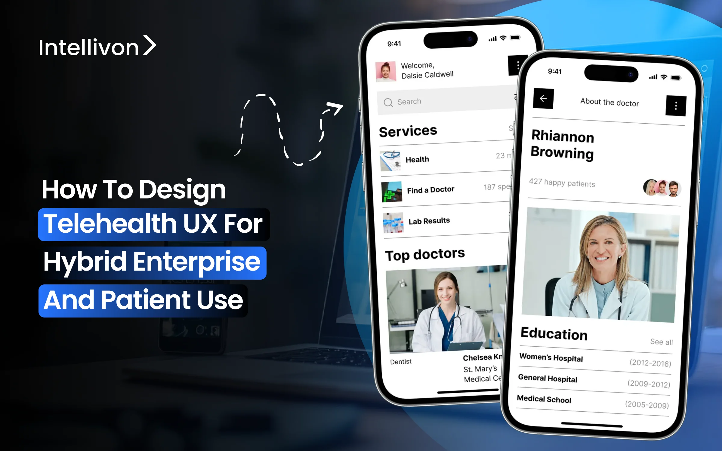
Most people judge telehealth platforms by how fast they can book an appointment or wrap up a video call. But that’s not what keeps a platform alive when thousands of patients, dozens of clinicians, and entire ops teams are using it daily. What actually keeps it running is knowing exactly who’s responsible for what as the system grows.
As these platforms scale, the success of their UX shifts from convenience to where patient needs, clinical judgment, and enterprise accountability meet. When this collision is not handled well, things start falling apart. This is where simple interfaces start masking real problems, tighter controls make everything harder to use, and the whole experience feels unstable. In fact, 70% of health apps are abandoned within 90 days when the user experience is poor.
Intellivon builds telehealth platforms where scale strengthens the system rather than straining it. When the enterprises we work with scale, UX remains stable, security stays tight, and the platform continues to handle increased complexity without introducing friction or risk. This blog explores how to design telehealth UX for hybrid enterprise and patient use, treating experience as a governed layer that aligns trust, control, and accountability as it scales.

Key Takeaways Of The Telehealth Platform Market
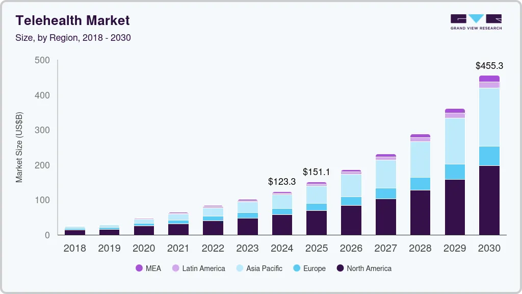
The global telehealth market was valued at approximately USD 123 billion in 2024 and is expected to expand to over USD 455 billion by 2030, growing at a compound annual rate of nearly 25% between 2025 and 2030. This rapid growth is being fueled by widespread adoption of digital health solutions, increasing smartphone penetration, stronger internet infrastructure, sustained investment activity, and ongoing advances in healthcare technology.
Market Insights:
- Telehealth usage remains nearly 40× higher than pre-COVID levels, indicating sustained, not temporary, adoption.
- In 2024, over 70% of physicians used telehealth weekly, nearly three times the 2018 adoption rate.
- On the patient side, more than half of U.S. adults have used telehealth, with close to 90% reporting satisfaction with recent virtual visits.
UX Design Effectiveness In Telehealth
- A large meta-review of telemedicine research found that over 80% of studies reported high patient and provider satisfaction, reinforcing UX as a critical driver of telehealth success.
- A controlled telehealth usability study showed strong alignment between usability and satisfaction, with both scoring above 5.5 on a 7-point scale and a high positive correlation.
- A 2025 usability study reported that 60%+ of users experienced high telehealth usability, with strong perceptions of usefulness, ease of use, and future adoption intent.
What Is Hybrid Telehealth UX?
A successful hybrid telehealth UX is one system that works for patients, clinicians, and platform teams without creating unnecessary friction for any of them. The goal is not uniformity, but coordination across roles with very different needs.
For patients, the experience should feel simple and predictable. They should be able to book care, share information, and understand next steps without confusion. When someone needs care, clarity matters more than features.
Behind the scenes, those same actions must carry more responsibility. The platform needs to verify identity, protect privacy, inform clinicians, and generate records that stand up to audits. None of this should spill into the patient experience as extra steps or complexity. Hybrid telehealth UX avoids forcing trade-offs. When a patient acts, care teams see the right context. When rules must be enforced, they appear naturally, not bureaucratically.
At its core, hybrid UX treats experience as part of the platform foundation. It shapes how care flows, how accountability is maintained, and how trust is held as usage scales across regions and services.
Common Misconceptions About Hybrid Telehealth UX
Hybrid telehealth UX is often misunderstood because it is approached as a design or tooling problem. In reality, most failures come from misaligned assumptions about how experience, control, and responsibility should work together at scale. Below are the most common misconceptions enterprises run into.
1. One Interface Should Work for Everyone
A shared interface sounds efficient, but it weakens accountability. Patients, clinicians, and operations teams carry different responsibilities. Forcing them into the same experience surface blurs ownership and increases risk.
2. A Patient App Plus an Admin Dashboard Is Enough
Separating patient and admin experiences feels clean at first. Over time, it fragments workflows. Actions taken by patients lose context before reaching clinical or operational teams, creating blind spots.
3. Visual Consistency Equals Good UX
Design systems improve appearance, not governance. Consistent colors and layouts do not guarantee clarity, traceability, or control. Experience quality depends on how decisions and rules are surfaced, not how screens look.
4. Less Friction Always Means Better Experience
Removing friction without intent hides risk. Some steps exist to protect patients, clinicians, and the enterprise. The challenge is placing friction where it adds safety, not removing it entirely.
Hybrid telehealth UX is not about simplifying everything or standardizing interfaces. It is about aligning responsibility across roles through experience. When that alignment is missing, platforms feel polished but unstable as they scale.
Why Enterprise Telehealth Requires A Different UX Model
Telehealth UX that works in small pilots often struggles once platforms scale across teams, regions, and regulations. The reason is simple. Enterprise telehealth operates under constraints that consumer-style UX was never designed to handle. As usage grows, experience design becomes a structural requirement, not a cosmetic one.
1. Different Stakes, Different Expectations
In enterprise environments, every interaction carries consequences. Patient actions can trigger clinical decisions, financial workflows, or regulatory obligations. UX must reflect this reality.
A flow that feels harmless at low volume can create risk when thousands of users repeat it daily.
2. Governance Cannot Be an Afterthought
Enterprises cannot rely on policy documents alone. Rules need to be enforced through experience. Identity checks, consent capture, escalation paths, and documentation must appear naturally within workflows.
When UX fails to surface these controls clearly, teams fall back on manual oversight and workarounds.
3. Scale Exposes Experience Gaps
At scale, inconsistencies become visible fast, different departments interpret the same workflow differently, patients receive mixed signals, and clinicians lose context.
UX must act as a stabilizing layer that keeps behavior consistent as complexity increases.
4. Multiple Roles Share the Same Workflow
Enterprise telehealth involves patients, clinicians, operations, and compliance teams interacting with the same system. A single-user UX model cannot serve all of them well. Experience design must adapt by role while remaining grounded in one shared process.
Enterprise telehealth requires a UX model built for responsibility, not just convenience. When experience design accounts for scale, governance, and shared accountability, platforms remain stable as adoption grows. Without it, even well-funded telehealth systems begin to fracture under their own complexity.
84% of Studies Report Higher Telehealth Platform Satisfaction With Good UX
Telehealth success is often discussed in terms of access, coverage, or clinical outcomes. However, large-scale research points to a simpler truth. When telehealth platforms feel clear, predictable, and easy to use, satisfaction rises sharply across both patients and providers. UX quality is not a supporting factor. It is a primary driver of adoption and long-term use.
A meta-review of telemedicine systematic reviews found that around 84% of studies reported acceptable or high satisfaction among patients and clinicians. Across these studies, experience design repeatedly emerged as a deciding factor.
Why Satisfaction Tracks UX Quality
Satisfaction increases when users understand what is happening and what is expected of them. Clear navigation, predictable flows, and transparent communication reduce uncertainty during care interactions. As a result, patients feel more confident, while clinicians experience less friction during delivery.
Provider Satisfaction Depends on Experience Clarity
Clinicians do not disengage because of telehealth itself. They disengage when platforms interrupt workflows, obscure responsibility, or add cognitive load. UX that respects clinical context and decision-making improves provider confidence and consistency.
Consistency Builds Trust Over Time
High satisfaction is not driven by novelty. It is driven by consistency. Platforms that behave the same way across visits, roles, and scenarios create trust. Over time, that trust translates into continued usage and lower resistance to scale.
What the 84% Figure Really Signals
This statistic does not suggest that “better design looks nicer.” It shows that experience quality directly shapes whether telehealth feels reliable or risky. When UX removes ambiguity, satisfaction follows. When it introduces confusion, adoption slows.
The evidence is clear. Telehealth platforms that invest in strong UX foundations achieve higher satisfaction across patients and providers alike. At enterprise scale, this satisfaction is not cosmetic. It determines whether telehealth becomes a trusted care channel or an operational liability.
UX Models Used In Telehealth Platforms At Enterprise Scale
As telehealth platforms mature, their UX models evolve, sometimes intentionally, often by accident. Each model solves a specific problem in the short term. However, most begin to show cracks once the platform expands across users, regions, and regulatory boundaries. Understanding these models helps enterprises recognize why certain designs stall while others scale.
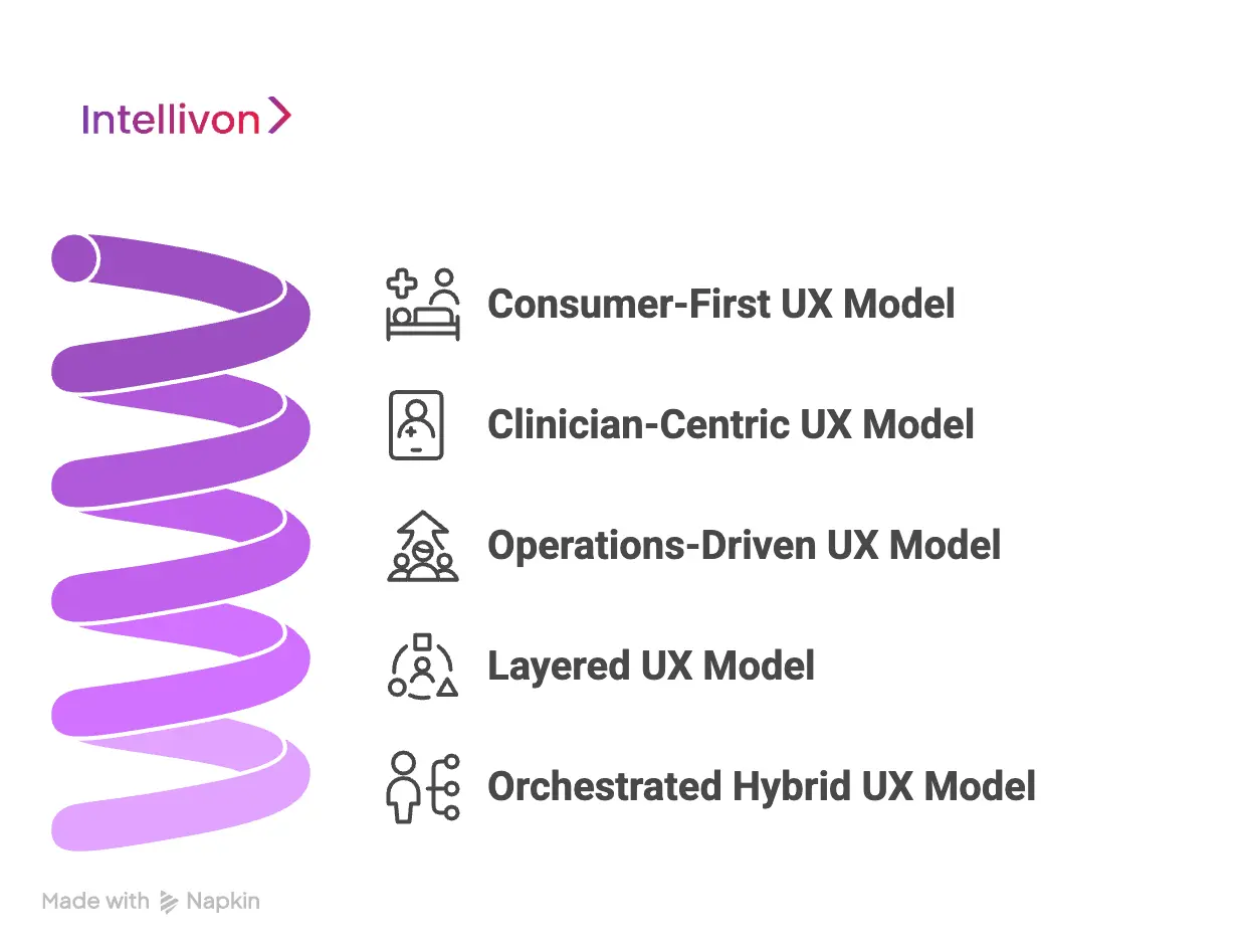
1. Consumer-First UX Model (Access-Led)
This model prioritizes speed and ease of access. Patients can book quickly, share minimal information, and connect to care with little friction. Early adoption is usually strong because the experience feels familiar and lightweight.
However, compliance and governance suffer as volume increases. Clinical context remains thin, audit trails weaken, and responsibility becomes unclear. What feels simple at low scale turns risky when thousands of interactions follow the same ungoverned path.
2. Clinician-Centric UX Model (Workflow-Led)
Here, UX is designed around clinical workflows and documentation accuracy. Providers gain structured views, decision support, and clear records. From an enterprise standpoint, control and traceability improve.
Patient engagement often declines over time. Onboarding feels heavy, interactions feel transactional, and continuity suffers. As a result, adoption slows in longitudinal or experience-driven care models.
3. Operations-Driven UX Model (Admin-Led)
This model emphasizes oversight, reporting, and throughput. Dashboards, queues, and metrics drive daily operations. Leaders gain visibility and operational predictability.
Care experience becomes brittle. Patients feel routed instead of supported, while clinicians feel managed rather than trusted. UX optimizes efficiency but loses connection to real care delivery.
4. Layered UX Model (Patient and Admin Separation)
Separating patient and admin experiences reduces immediate friction. Each group gets a tailored interface, which works well in early scaling phases.
Over time, workflows fragment. Context fails to travel between layers, and governance gaps emerge. Actions taken in one interface lose meaning in another, increasing manual reconciliation.
5. Orchestrated Hybrid UX Model (Enterprise-Grade)
This model treats UX as a shared, governed experience layer. One workflow powers multiple role-adaptive surfaces. Patients see clarity, clinicians see context, and operations see control.
Because governance is embedded into the experience itself, this model scales safely across regions and care types. Responsibility stays aligned as usage grows.
Every telehealth UX model solves a problem. Only one solves for scale. Orchestrated hybrid UX aligns access, accountability, and control within a single system. That alignment is what allows enterprise telehealth platforms to grow without breaking trust or governance.
Core Principles Of Designing Hybrid Telehealth UX
Designing hybrid telehealth UX is less about creativity and more about discipline. At enterprise scale, experience design must translate rules, responsibilities, and safeguards into interactions people can follow naturally.
These core principles turn hybrid UX from an abstract idea into a reliable design framework.
1. UX as Policy Enforcement
In enterprise telehealth, policies cannot live only in documents. They must show up in the experience itself. UX becomes the human-facing expression of platform rules, guiding users toward compliant behavior without constant supervision.
When done well, compliance feels built in rather than imposed. Identity checks, consent steps, and escalation paths appear at the right moments. Users understand what is required without feeling slowed down or monitored.
2. Role-Adaptive Experiences on a Shared Core
Hybrid UX relies on one shared workflow, not multiple disconnected journeys. Patients, clinicians, and operations teams interact with the same process, but each sees a view shaped by their responsibility.
This approach prevents context loss. Information entered once travels cleanly across roles. Decisions made in one place remain visible and meaningful elsewhere, reducing errors and rework.
3. Friction Where It Protects, Flow Where It Serves
Not all friction is bad. Some steps exist to protect patients, clinicians, and the enterprise. Verification, confirmations, and handoffs should slow users down only when risk is present.
At the same time, low-risk and repeat actions should move quickly. When UX balances protection with flow, platforms feel both safe and efficient.
Strong hybrid telehealth UX follows clear principles. It enforces policy through experience, adapts by role without fragmenting workflows, and applies friction with intent. Together, these principles keep platforms usable, compliant, and stable as they scale.
Key UX Layers In A Hybrid Telehealth Platform
Hybrid UX becomes tangible inside the experience layers that users touch every day. These layers determine whether the platform feels reliable or fragmented as scale increases. When designed together, they create continuity, and when developed in silos, they introduce risk.
1. Intake and Onboarding UX
Intake is the first trust checkpoint. Patients should understand what is required and why, without feeling interrogated. Identity verification, eligibility checks, and consent capture must happen smoothly and predictably.
For the enterprise, this layer establishes legal and clinical foundations. Poorly designed intake creates drop-offs or incomplete records. Strong intake UX balances speed with clarity, ensuring compliance without abandonment.
2. Consultation and Interaction UX
During consultations, the experience must support calm, focused care. Patients need reassurance and clarity. Clinicians need full context, structured inputs, and decision control.
AI-assisted features should support note-taking, triage cues, or risk alerts. However, UX must make accountability explicit. Decisions should never feel automated or opaque, especially in regulated care settings.
3. Post-Visit and Continuity UX
Care rarely ends with a single interaction. Patients need clear next steps, follow-ups, and access to care plans. UX should reinforce continuity rather than closure.
For enterprises, this layer maintains longitudinal context. When post-visit UX is weak, care becomes episodic and fragmented, increasing repeat visits and operational strain.
4. Administrative and Operations UX
Operations teams require visibility without constant intervention. UX should surface workload patterns, exceptions, and bottlenecks clearly. The goal is informed oversight, not micromanagement.
Well-designed operations UX reduces manual work. It also improves audit readiness by making workflows and outcomes easy to trace.
5. Communication and Notification UX
Between visits, communication shapes perception. Messages, reminders, and updates should feel timely and relevant, not noisy. Patients should always know what to expect next.
From an enterprise perspective, communication must be governed. Every message should align with the care context, clinical rules, and documentation requirements.
6. Billing and Entitlement UX
Access to care is tied to coverage, eligibility, and payment logic. UX should make these boundaries visible early, not after care is delivered.
When billing rules are unclear, trust erodes quickly. Clear entitlement UX protects both patients and the enterprise from disputes and rework.
Hybrid telehealth UX depends on how these layers work together. Intake, consultation, continuity, operations, communication, and billing must function as a unified system. When they do, platforms scale with confidence, consistency, and control rather than friction.
Features That Matter In Hybrid Telehealth UX
Hybrid UX intent only holds if the platform supports it at a functional level. These features determine whether experience design survives real-world pressure from regulators, clinicians, and growing patient volumes. Without them, even well-designed flows begin to erode as scale increases.
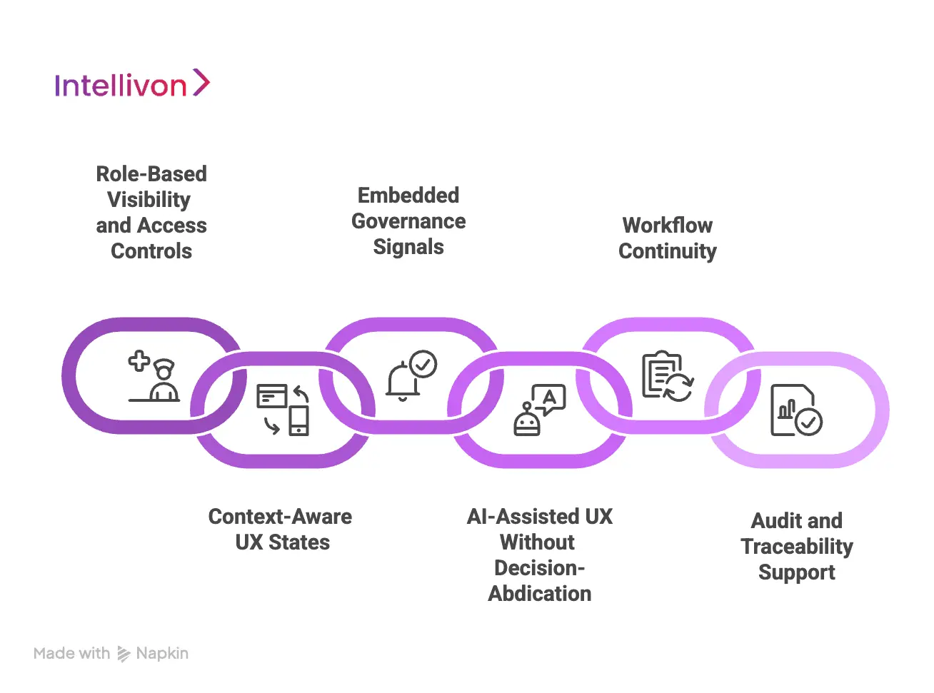
1. Role-Based Visibility and Access Controls
In hybrid telehealth, visibility is a design decision, not a security afterthought. Patients, clinicians, and enterprise teams operate within the same workflows, but their responsibilities differ. UX must reflect those differences clearly.
Effective role-based controls ensure that each user sees information relevant to their role and moment in the care journey. Patients see guidance and next steps. Clinicians see clinical context and decision history. Operations teams see status, exceptions, and trends. This separation reduces confusion, limits data exposure, and reinforces accountability without fragmenting the experience.
2. Context-Aware UX States
A single, static UX cannot support the variability of telehealth care. Risk levels change, conditions evolve, and user roles shift throughout the journey. Context-aware UX adapts to these changes in real time.
Low-risk interactions should move quickly with minimal interruption. Higher-risk scenarios should slow the experience and surface additional confirmation or review. When UX responds to context instead of forcing uniform flows, platforms feel both efficient and safe.
3. Embedded Governance Signals
Governance works best when it is visible but not intrusive. Users should never wonder whether consent was captured, escalation was triggered, or a review is pending.
Embedded governance signals make these states clear within the experience. Consent indicators, review markers, and escalation paths appear naturally as part of the workflow. This transparency reduces mistakes, shortens resolution time, and builds confidence across teams.
4. AI-Assisted UX Without Decision Abdication
AI can improve telehealth UX when it supports people rather than replaces them. It can summarize interactions, surface risks, and guide navigation through complex workflows.
However, UX must always clarify where human judgment applies. Decisions should remain attributable to clinicians and authorized staff. When AI support is transparent and contextual, it increases trust. When it feels automated or opaque, it undermines confidence.
5. Workflow Continuity Across the Platform
Hybrid UX breaks down when features operate as isolated tools. Information entered during intake should inform consultations. Decisions made during visits should shape follow-ups and operations.
Strong workflow continuity ensures that actions taken in one area carry meaning across the platform. This reduces rework, prevents context loss, and keeps care coordinated as more users engage with the system.
6. Audit and Traceability Support
Enterprise telehealth platforms must be ready for scrutiny at any time. UX should make it easy to understand who performed an action, when it occurred, and why it happened.
When traceability is built into the experience, audits become routine reviews rather than disruptive events. Teams spend less time reconstructing histories and more time improving care delivery.
Hybrid telehealth UX depends on features that reinforce responsibility at every step. Role-based visibility, adaptive states, governance signals, AI support, workflow continuity, and traceability work together to keep platforms stable as they scale.
When these capabilities are present, UX becomes a source of confidence rather than a point of failure.
How We Design And Build Hybrid Telehealth UX At Enterprise Scale
At Intellivon, hybrid telehealth UX is engineered as part of the platform’s core operating logic. We design experience with the assumption that scale, regulation, and complexity are inevitable. Every step below exists to prevent breakdowns that typically appear months after launch, not on day one.
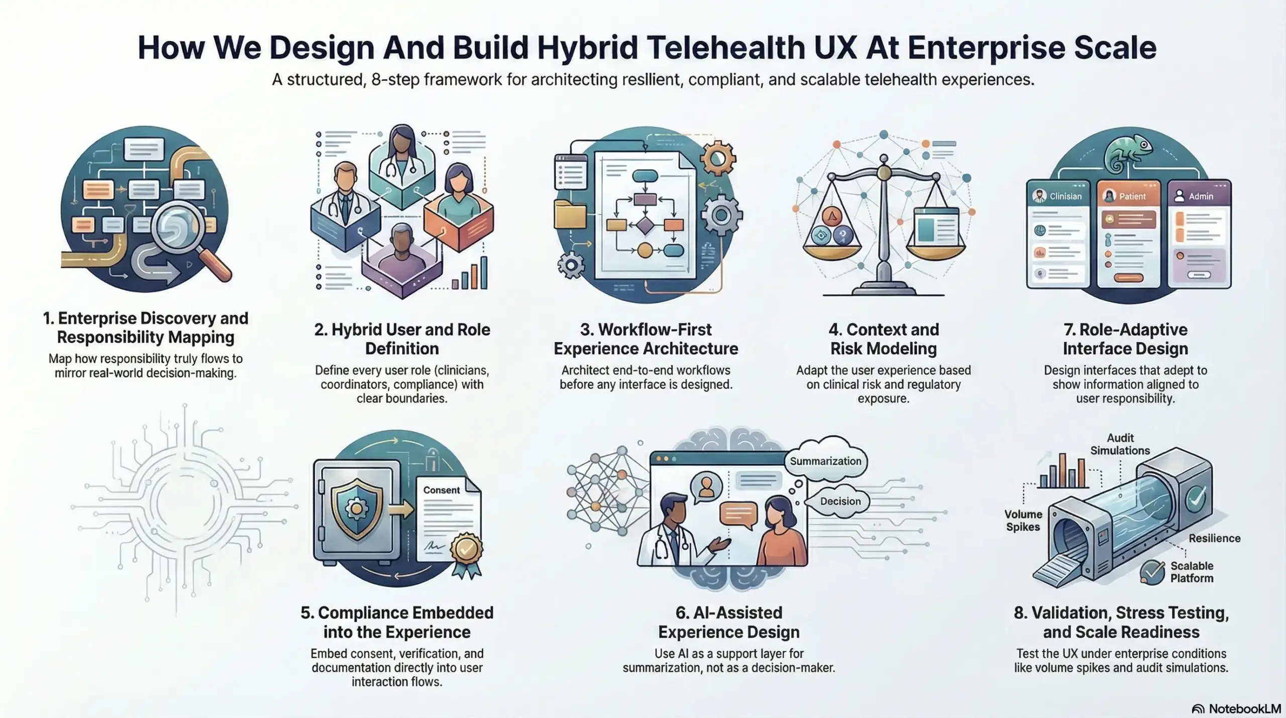
Step 1: Enterprise Discovery and Responsibility Mapping
We start by understanding how responsibility actually flows through the organization today. This includes how patients enter care, where clinical judgment is applied, how operations intervene, and where compliance obligations surface.
Most telehealth UX fails because it reflects idealized workflows rather than real execution. By mapping responsibility early, we ensure experience design mirrors how decisions, approvals, and escalations truly happen across teams and systems.
Step 2: Hybrid User and Role Definition
Enterprise telehealth platforms involve far more than patients and clinicians. Care coordinators, operations teams, compliance reviewers, and leadership stakeholders all interact with the same system in different ways.
We define every role with clear boundaries. What they can see, what they can act on, and when they are accountable is established upfront. This prevents role overlap, hidden ownership gaps, and silent failures as usage grows.
Step 3: Workflow-First Experience Architecture
Before any interface is designed, we architect workflows end-to-end. This includes intake, consultation, follow-up, escalation, documentation, and reporting.
UX is then built on top of this shared workflow foundation. As a result, patients, clinicians, and enterprise teams interact with the same process, not parallel versions of it. This is critical for maintaining consistency and traceability at scale.
Step 4: Context and Risk Modeling
Telehealth interactions vary widely in risk and consequence. A symptom check-in is not the same as a prescribing decision or post-discharge escalation.
We model these differences explicitly. UX adapts based on clinical risk, regulatory exposure, and user role. Higher-risk scenarios introduce deliberate checks and confirmations. Lower-risk actions remain efficient. This keeps platforms safe without becoming slow.
Step 5: Compliance Embedded into the Experience
Compliance breaks when it is treated as a checklist instead of a lived experience. We embed consent capture, identity verification, and documentation requirements directly into interaction flows.
Users encounter compliance steps when they are relevant, not arbitrarily. This reduces resistance, improves completion rates, and ensures audit readiness without relying on manual enforcement.
Step 6: AI-Assisted Experience Design
AI is introduced as a support layer, not a decision-maker. We apply AI to assist with summarization, prioritization, and navigation across complex workflows.
UX always makes decision ownership explicit. Clinicians and authorized teams remain accountable for outcomes. This transparency is essential for trust, regulatory clarity, and long-term adoption.
Step 7: Role-Adaptive Interface Design
With workflows and governance in place, we design experience surfaces that adapt by role and context. Each user sees information aligned to their responsibility and timing.
This approach avoids fragmented tools while preserving clarity. Everyone operates within one platform, but no one is overwhelmed by irrelevant detail.
Step 8: Validation, Stress Testing, and Scale Readiness
Before deployment, we test UX under enterprise conditions. This includes volume spikes, audit simulations, cross-region usage, and exception-heavy scenarios.
Experience design is refined until it remains stable under pressure. Only then is the platform ready to scale without erosion of trust or control.
Hybrid telehealth UX cannot be patched together over time. It must be designed deliberately, with responsibility and scale in mind. Intellivon’s approach ensures experience design supports growth, governance, and long-term resilience, turning telehealth platforms into dependable enterprise systems rather than fragile tools.
Common Mistakes Enterprises Make When Designing Telehealth UX
Telehealth UX rarely fails during pilots or early launches. Problems surface gradually as patient volumes increase, workflows overlap, and regulatory pressure intensifies. In most cases, the issue is not a lack of effort or intent, but experience design that was never built to carry enterprise responsibility over time.
Below are the most common mistakes we see when telehealth UX is designed without a true enterprise lens, along with how these challenges are resolved when experience is treated as part of the platform foundation.
1. Designing for Speed First
Many platforms focus early on reducing friction to drive adoption, especially during onboarding and access flows. While this approach delivers quick wins, it often creates fragile foundations that struggle under scale.
As usage grows, gaps begin to appear. Consent logic feels unclear, escalation paths vary by scenario, and responsibility becomes harder to trace across teams. At that point, governance is added reactively, introducing friction into an experience that users were trained to move through quickly.
A more durable approach embeds governance into UX from the start. When experience designers work alongside platform and compliance teams early, speed and accountability evolve together, allowing the platform to scale without disruption.
2. Treating Patient UX and Enterprise UX Separately
Another common assumption is that patient experience and enterprise experience should be designed independently. One team focuses on simplicity, while another builds administrative tools in parallel.
Over time, this separation fragments workflows. Actions taken by patients lose context before reaching clinicians, while operations teams rely on manual checks to reconnect information. What initially appears clean becomes inefficient as volume increases.
Designing UX on a shared workflow core eliminates this fragmentation. Patient actions translate directly into clinical and operational contexts, ensuring continuity across roles without forcing everyone into the same interface.
3. Over-Automating Interactions With AI
AI is often introduced to reduce workload and improve responsiveness, but when it is integrated without clear UX boundaries, confusion follows. Users may struggle to understand when AI is assisting and when a human is responsible.
In regulated care environments, this ambiguity creates risk and undermines trust. Decisions must feel owned, not generated.
A disciplined approach positions AI as a support layer. UX makes human authority explicit while allowing AI to assist with prioritization, summarization, and navigation, preserving confidence across users.
4. Designing Admin UX as Reporting Layer
Many enterprises invest heavily in dashboards and analytics, assuming visibility alone will drive control. Metrics look comprehensive, yet teams still struggle to act quickly. This turns administrative UX into a passive reporting surface rather than an operational tool. Issues are visible, but resolution remains slow and manual.
When operations UX is designed for action, not observation, teams gain clarity around ownership, exceptions, and next steps. This shortens response cycles and reduces operational drag.
5. Ignoring Continuity Beyond the Virtual Visit
Some platforms treat telehealth interactions as isolated events, resetting the experience after each visit. This breaks continuity for both patients and clinicians. Patients lose clarity around next steps, clinicians lose longitudinal context, and operations teams see disconnected data points. Over time, this erodes both outcomes and efficiency.
Designing UX around continuity keeps care connected across visits. Follow-ups, care plans, and documentation remain visible and consistent, strengthening trust while reducing operational noise.
Most telehealth UX failures are not technical, but are structural. When experience design ignores governance, shared workflows, and accountability, platforms become unstable as they scale. Treating UX as part of the enterprise foundation prevents these failures and enables telehealth systems to grow with confidence rather than complexity.
Conclusion
Hybrid telehealth UX is not a cosmetic upgrade. It is a structural requirement for platforms that need to scale safely across patients, clinicians, regions, and regulations. When experience design balances patient clarity with enterprise control, telehealth systems remain stable instead of brittle as adoption grows.
Enterprises that succeed treat UX as part of their operating foundation. They design experiences that move responsibility clearly, surface governance naturally, and adapt to real care complexity. This approach reduces operational friction, protects accountability, and strengthens trust over time.
Intellivon builds hybrid telehealth UX as enterprise infrastructure, helping organizations scale digital care with confidence and long-term impact.
Build A Hybrid Telehealth UX With Intellivon
At Intellivon, we design hybrid telehealth UX as an enterprise experience layer, not as interface polish or patient-facing flows added late in development. Our platforms are built to govern how patients engage with care, how clinicians operate with clarity and control, and how enterprises maintain accountability across every interaction.
Each solution is engineered for healthcare organizations operating at scale. Platforms are workflow-first and governance-led, ensuring that patient simplicity and enterprise control coexist within the same system. As adoption grows across service lines, regions, and care models, experience consistency, compliance enforcement, and operational stability remain intact.
Why Partner With Intellivon?
- Hybrid UX architecture aligned with enterprise governance, accountability, and scale requirements
- Deep experience integrating UX with EHRs, identity systems, care coordination tools, and analytics platforms
- Experience-led compliance that preserves patient trust while enforcing regulatory and clinical controls
- AI-assisted UX orchestration that improves navigation and efficiency without removing human authority
- Proven enterprise delivery approach with phased rollout, validation checkpoints, and scale readiness
Talk to Intellivon’s healthcare platform architects to explore how a hybrid telehealth UX can strengthen governance, improve adoption, and support long-term digital care growth with confidence.
FAQs
Q1. What is hybrid telehealth UX?
A1. Hybrid telehealth UX is an experience model that balances patient simplicity with enterprise control. It ensures patients can access care easily while enterprises maintain governance, accountability, and compliance across workflows.
Q2. Why doesn’t consumer-style UX work for enterprise telehealth platforms?
A2. Consumer UX prioritizes speed and convenience but lacks enforcement mechanisms. At enterprise scale, this leads to compliance gaps, unclear accountability, and operational instability as usage and regulatory complexity increase.
Q3. How does hybrid UX improve both patient experience and enterprise control?
A3. Hybrid UX uses shared workflows with role-adaptive views. Patients see clarity and guidance, while clinicians and operations teams see context, controls, and traceability without fragmenting the experience.
Q4. Where do enterprises most commonly get telehealth UX wrong?
A4. Most failures occur when UX is treated as interface design rather than system behavior. Designing patient and admin experiences separately, or adding governance later, creates fragmentation and risk at scale
Q5. How does Intellivon approach hybrid telehealth UX differently?
A5. Intellivon designs UX as part of the platform foundation. Experience, governance, workflows, and AI orchestration are built together, ensuring telehealth platforms remain stable, compliant, and scalable as adoption grows.